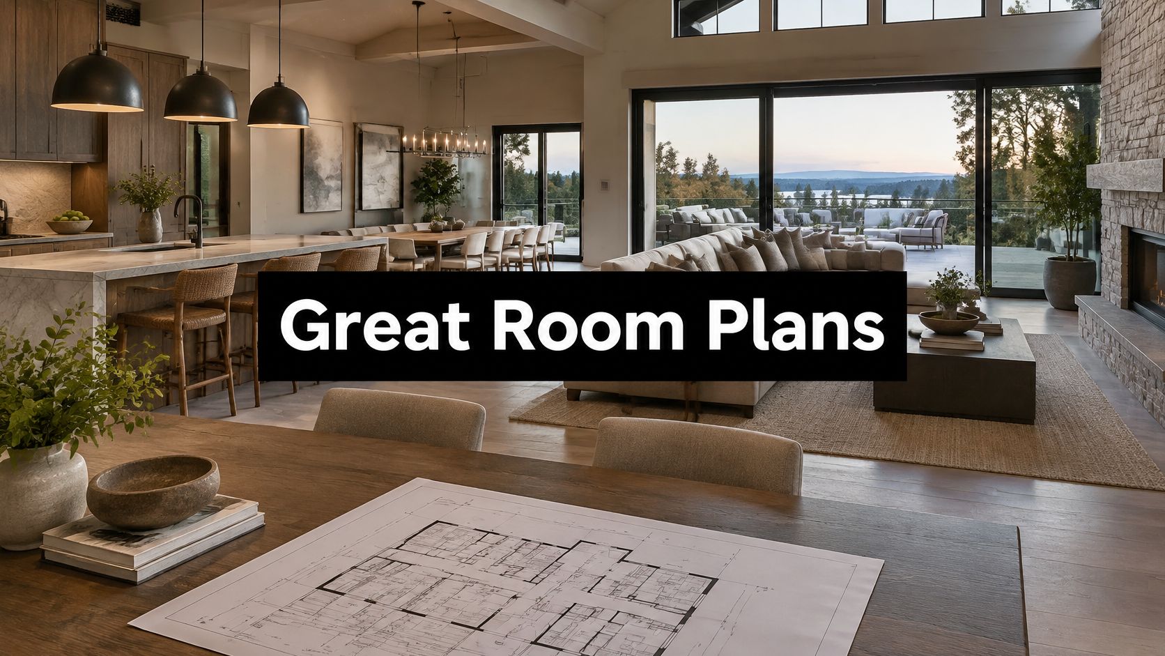

You've narrowed the renovation palette to warm white cabinetry, pale stone, and oak, but the samples look different beside your west-facing windows. The room you liked in a photograph feels glaring in your own house, and the furniture that looked elegant online seems too spare for everyday family life.
Modern transitional interior design can resolve that tension, provided you treat it as more than a decorating formula. For Phoenix luxury homes, the right approach connects comfort and architectural restraint with decisions about sun exposure, material stability, lighting, and construction.
What Modern Transitional Design Means in Practice
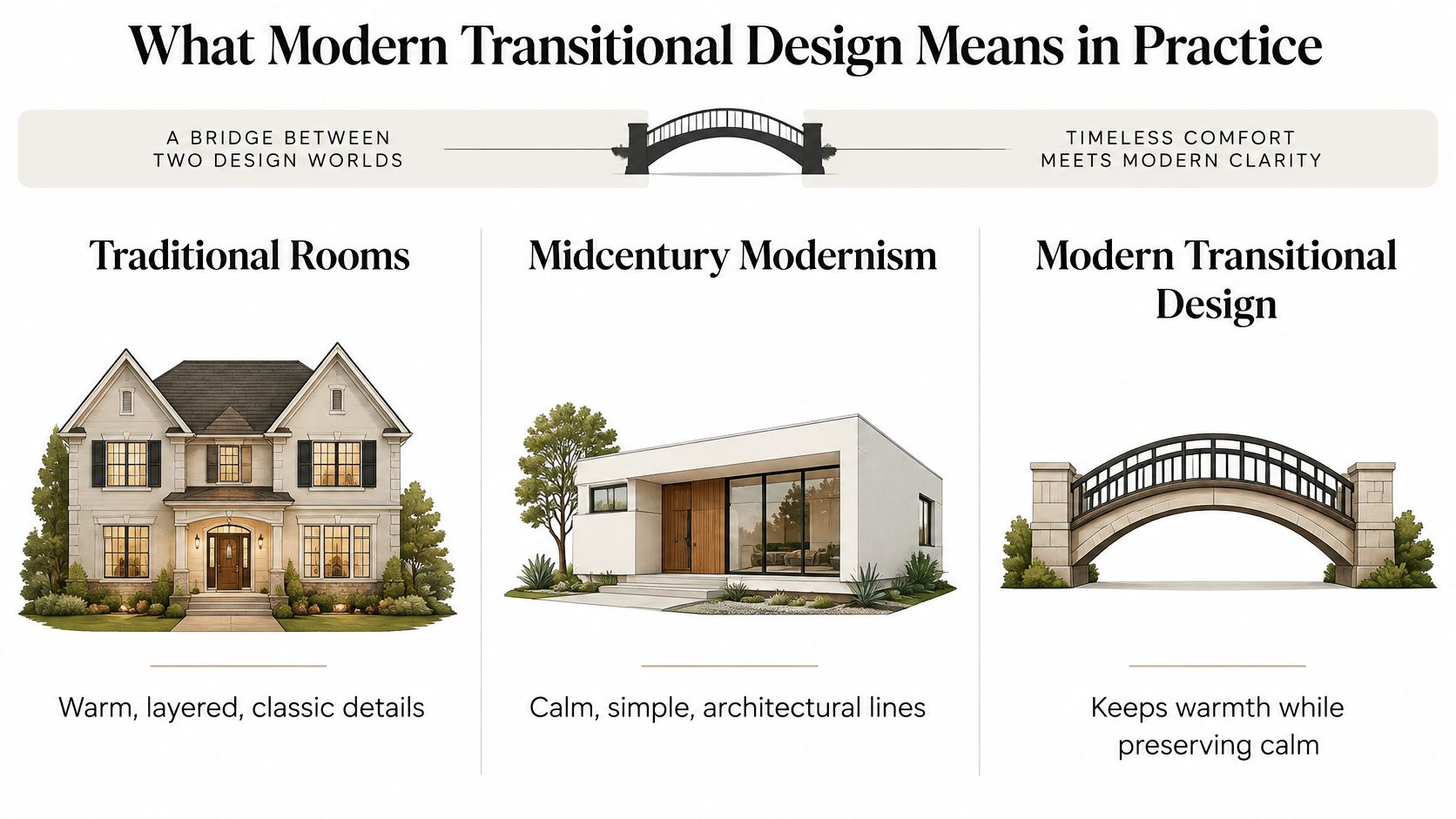
Think of traditional rooms as a warm, layered house and midcentury modernism as a clean white box. Transitional design is the bridge: it preserves the welcome of the house without losing the calm of the box.
As ELLE Decor's transitional-style history explains, the traditional vocabulary draws on European precedents from the 1700s and 1800s, while the blend with modernism evolved from the middle of the 20th century into the late 1960s rather than beginning as a single movement. Crown molding, chandeliers, patterned rugs, and formal furniture supplied the decorative inheritance; modernism introduced cleaner geometry and restrained materials.
Continuity Rather Than Compromise
The foundational principle is continuity. Keep familiar comfort, balanced proportions, and craftsmanship, then simplify the ornament so the architecture and furnishings can coexist.
That doesn't mean averaging every design decision. A room can have traditional paneling and distinctly contemporary seating, provided their scale, finish, and visual weight relate.
Traditional, modern and modern transitional compared
| Element | Traditional | Modern | Modern Transitional |
|---|---|---|---|
| Ornament | Crown molding, chandeliers, patterned rugs | Minimal or none | Selective millwork and one statement fixture |
| Lines | Curved, ornate profiles | Straight, geometric forms | Clean lines with classic proportions |
| Color | Rich, layered hues | Stark white with bold accents | Tonal, neutral base |
| Materials | Carved wood, damask, marble | Steel, glass, concrete | Natural wood, stone, linen with simple metals |
| Furniture | Formal, matched sets | Low, sculptural pieces | Streamlined yet comfortable pieces |
These are useful comparison cues, not rigid historical boundaries. The practical distinction is how much visual information each element contributes.
For luxury home builders, this approach allows modern layouts and generous glazing without forcing every interior surface into a minimalist vocabulary. For homeowners considering luxury whole house remodeling, it also provides a way to retain worthwhile architectural details instead of stripping the house indiscriminately.
A transitional room should feel edited, not emptied.
Test any proposed room with these questions: Is the ornament restrained? Are the lines clean? Does the texture add warmth? If the answer to any is no, adjust the most visually dominant element before buying accessories.
Adapting the Style to Phoenix Heat, Glare and Dry Air
West-facing glass can turn an appealing sitting area into a place nobody wants to use in the afternoon. South-facing openings also need careful solar planning, especially where pale floors and countertops reflect light toward seated eye level.
Arizona summer design guidance identifies west- and south-facing glazing as sources of heat gain and glare and flags wood movement and veneer durability as desert concerns. Address those conditions before approving the finish package.
Specify the Assembly, Not Just the Surface
Solar-control glazing, exterior shade, and interior window treatments perform different jobs. Glazing helps manage incoming solar energy, exterior shading intercepts sun, and interior shades help occupants control brightness and privacy.
Ask the builder to coordinate shade pockets, electrical feeds, and access for motorized equipment before ceilings close. Concealing those provisions is easier than concealing a retrofit.
Material performance in Phoenix conditions
| Material | Phoenix performance | Specification |
|---|---|---|
| Solid wood | Expands and contracts as moisture conditions change in dry air | Use stable engineered construction for large panels |
| Engineered veneer | Delamination risk when cores are low grade | Specify quality cores and certified adhesives |
| Porcelain | Heat tolerant and low maintenance | Use for floors, bathrooms and covered patios |
| Natural stone | Heat tolerant, cool underfoot indoors | Choose honed finishes to reduce glare |
| Upholstery | Fades under direct sun | Use solution-dyed performance fabric |
| Exterior paint | Heat and UV exposure | Choose matte, UV-stable formulations |
A veneer specification should identify the core, adhesive certification, edge treatment, and approved installation conditions. A beautiful face veneer doesn't compensate for an unsuitable substrate, and engineered construction doesn't eliminate the need for movement allowances.
Porcelain is a strong choice where low maintenance matters. Stone offers natural variation and tactile depth, but homeowners must accept its care requirements; exterior stone can also become hot in direct sun despite feeling cool indoors.
Make Indoor-Outdoor Continuity Practical
Carry undertones and texture onto a covered patio rather than automatically repeating the exact indoor product. Exterior flooring needs an appropriate slip rating, drainage detailing, and approval for the exposure.
Solution-dyed performance upholstery improves fade resistance, but it isn't a substitute for shade. For exterior paint, choose a manufacturer-approved low-sheen system suited to the substrate rather than assuming any matte paint will survive outdoors.
Climate rule: A timeless appearance isn't proof of durability. Approve the material's construction and exposure suitability before approving its color.
Palette and Materials That Define the Look
Control contrast rather than maximizing it. Pair quiet wall planes, simple cabinetry, and clean hardware with selective traditional cues, such as framed millwork or a classic stone profile.
Neutral doesn't have to mean timid. In the National Kitchen & Bath Association's 2026 Kitchen Trends Report, 96% of surveyed design professionals identified neutral colors as the most popular kitchen color direction, according to the NKBA report announcement. That finding concerns kitchens, but it supports using a restrained foundation where cabinetry and adjoining living spaces meet.
Build a Finish-Control Board
Start with the largest fixed surfaces: flooring, cabinetry, and walls. Establish a related undertone family, then introduce wood grain, linen, wool, plaster, or honed stone for depth.
The WELL color-quality standard explains that perceived color involves the light source's spectrum, the object's absorbance and reflectance, and human visual response. That's why coordinating paint names alone won't prevent a cabinet from looking pink beside a green-gray floor.
Palette and material choices by surface
| Surface | Color direction | Preferred materials | Avoid |
|---|---|---|---|
| Walls | Warm greige or soft white | Limewash or matte plaster | High-gloss saturated paint |
| Cabinetry | White or warm neutral | Painted shaker or flat-panel wood | Mixed accent colors across one run |
| Flooring | Light to mid-tone oak color family | Honed limestone or large-format porcelain | Dark glossy stone in glare-heavy rooms |
| Stone | Veined neutral | Honed marble or quartzite | Heavily veined cool-white slabs |
| Upholstery | Linen or wool in neutral tones | Performance fabric | Thin silks in direct sun |
| Metals | Brushed brass or nickel | Matte bronze hardware | Mixed metal finishes on one wall |
Treat the avoid column as a starting point for restraint, not a prohibition on expressive design. A dramatic slab can work, but it should replace other focal features rather than compete with them.
For comparing cream, sand, and taupe stone character, the Varun Marbles guide to beige textures offers useful visual context. Use references to describe the texture you're seeking, then approve the actual slab or production sample.
Approve at Installation Scale
Assemble wall paint, cabinet finish, flooring, stone, metal, and upholstery on a physical control board. Review it vertically and horizontally as appropriate, under the proposed LED source during daytime and evening conditions.
Then move beyond the board. Paint a substantial wall sample, inspect full stone slabs, and lay flooring pieces together so grain and shade variation become visible.
Small chips are useful for elimination, not final approval. Record the accepted product, finish, sample reference, and installation location so the purchasing team doesn't substitute something that merely sounds equivalent.
Lighting Layers and Specifications That Hold the Palette Together
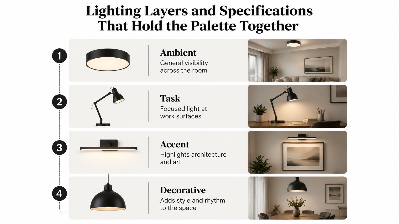
In a Phoenix great room, the same wall color can read differently in daylight and after dark. Plan functional lighting before choosing a chandelier: ambient light provides general visibility, task lighting serves work surfaces, and accent lighting reveals architecture or art. Decorative fixtures add character, but should not carry the room's full lighting load.
A pendant may leave the countertop below it poorly lit. Recessed lights can brighten the floor while flattening faces and textured walls. Layering light addresses both problems without relying on glare-heavy overhead brightness.
Specify Color Quality Alongside Brightness
The WELL Building Standard's color-quality benchmark specifies CRI of at least 80 and R9 of at least 50. For a luxury-home lighting schedule, use CRI 90 or higher as the practical design target. CRI describes general color rendering; R9 measures rendering of saturated reds, which affects how skin and warm materials appear.
Weak color rendering can make finishes that sit beside each other look unrelated. More brightness will not correct poor color quality, and a warmer color temperature does not automatically improve it.
Lighting layers and target specifications
| Layer | Purpose | Specification | Placement example |
|---|---|---|---|
| Ambient | General visibility | CRI 90 or higher, consistent color-temperature family, dimming | Recessed downlights in connected public rooms |
| Task | Work surfaces | CRI 90 or higher; R9 of at least 50 as the WELL benchmark | Under-cabinet LEDs in kitchens |
| Accent | Art and architecture | CRI 90 or higher for accurate finish rendering | Wall washers on stone or plaster |
| Decorative | Visual character, not the only light | Same color-temperature family as functional lights | Pendants over islands and dining tables |
| WELL minimum | Perceived color accuracy and comfort | CRI of at least 80 and R9 of at least 50 | Functional luminaire schedule |
| Daylight check | Evaluate perceived color changes | Compare samples in daylight and under installed LEDs | Main windows, kitchens, dressing areas, galleries and bathrooms |
Coordinate Controls and Placement
Keep connected public rooms within a consistent color-temperature family, then adjust intensity with compatible dimming. In an open plan, different lamp colors can make a continuous wall finish look like several unrelated paint choices.
Specify the driver, dimmer, and luminaire as a compatible combination. Before placing the full order, test dimming at low output for flicker, abrupt shutoff, and inconsistent light levels.
Place under-cabinet lights toward the working edge, with shielding to hide visible LED dots. Use wall washers for broad illumination and adjustable accents when artwork needs a controlled beam.
Before electrical rough-in: Confirm fixture locations against cabinetry elevations, furniture plans, and artwork positions, not just the ceiling grid.
Review color quality carefully in kitchens, dressing areas, galleries, and bathrooms. In Phoenix, assess these spaces in daylight and again after dark, when electric light determines how the palette reads.
Furniture and Millwork Choices That Balance Comfort and Restraint
Comfort is the first furniture test. A sofa with rounded arms can feel transitional without carved legs or elaborate upholstery, while a sculptural chair that nobody enjoys sitting in is an obstacle.
Slipper chairs, refined bed frames, and dining tables with classic proportions usually provide enough familiarity. Choose the silhouette first, then evaluate fabric, cushion support, seat height, and how the piece relates to neighboring furniture.
Scale for Daily Use
A generous great room needs anchoring pieces with enough substance to hold the seating group together. Substantial seat depth can be comfortable for lounging, but pair it with seating that also works for shorter occupants or upright conversation.
In a smaller room, a visually light traditional chair can provide character without the bulk of a matched suite. Test circulation with painter's tape on the floor and account for pulled-out dining chairs, open cabinet doors, and the route to the patio.
For thinking through seating relationships, Giorgi Bros. Furniture's discussion of furniture layouts for everyday living is a useful companion to a measured floor plan. The final arrangement still needs to fit your household's routines.
Let Millwork Supply the Traditional Note
Use framed wall paneling, a classic cabinet profile, or a simple crown at a deliberate architectural location. If crown occurs only at a feature wall, resolve its returns and adjacent transitions so it doesn't look unfinished.
Choose clean-lined matte bronze or brushed nickel hardware and keep the finish consistent within the room. For a major renovation, include those decisions in the whole-home renovation scope so blocking, cabinet drilling, and finish schedules align.
Evaluate each piece with a short checklist:
- Comfort: Does it invite the way you sit, eat, or rest?
- Profile: Does its outline reinforce a classic proportion or a clean architectural line?
- Circulation: Can people move naturally around it without shifting another piece?
Restraint doesn't mean buying less comfortable furniture. It means avoiding redundant statements so the room feels inhabited rather than staged as a showroom.
Three Phoenix Implementations in Practice
These illustrative scenarios show how the same design language can produce different decisions. They aren't claimed project results, and the lighting temperatures are hypothetical selections, not universal prescriptions.
Paradise Valley Kitchen Remodel
Suppose a homeowner keeps the kitchen footprint but replaces visually busy cabinetry with tonal fronts. A framed millwork feature around the pantry supplies the traditional cue, while honed limestone flooring gives the room a quieter foundation.
For this hypothetical scheme, specify under-cabinet task lighting at 3000K with CRI 90 and coordinate dimmable island pendants with that selection. The decisive move is concentrating the framed detail at the pantry instead of repeating decorative profiles on every cabinet.
The trade-off is functional: keeping the footprint avoids some layout intervention, but it won't fix a poorly placed sink or an awkward route through the kitchen. The homeowner must decide whether the existing workflow deserves to remain.
Scottsdale Great Room and Covered Patio
Consider a new build where the great room opens to a covered patio. In this hypothetical plan, a consistent 2700K lighting family connects the public rooms, solar-control glazing addresses west-facing exposure, and linen-look performance upholstery softens a stone-look porcelain floor.
The defining decision is repeating the floor's quiet undertone outdoors while selecting an exterior-rated surface. The homeowner gets visual continuity without requiring identical indoor and outdoor products.
The trade-off is that solar-control glass and shade fabrics can change view clarity and perceived color. Evaluate glazing and fabric samples from the actual seated position before approval.
Arcadia Primary Suite and Casita
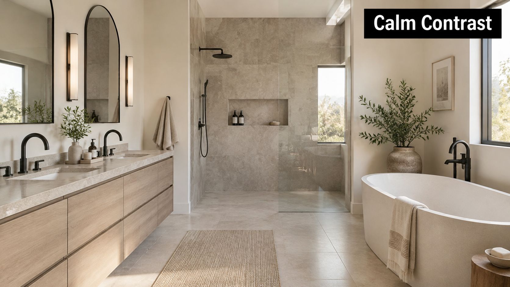
For an Arcadia suite with a companion casita, use neutral finishes, classic bed proportions, and matte bronze hardware in the main residence. Carry the palette into the casita through porcelain, durable painted cabinetry, and simpler trim rather than duplicating expensive stone.
The defining decision is matching undertones and proportions instead of matching purchase prices. The trade-off is variation in tactile richness, which is reasonable when the secondary space needs easier maintenance.
Use the residential project gallery to identify details you want to discuss with your design-build team, not as a substitute for specifications. Each illustrative scheme begins with a finish-control board and a climate check before the homeowner commits to a style package.
Hire a Luxury Builder to Carry the Style from Plan to Permit
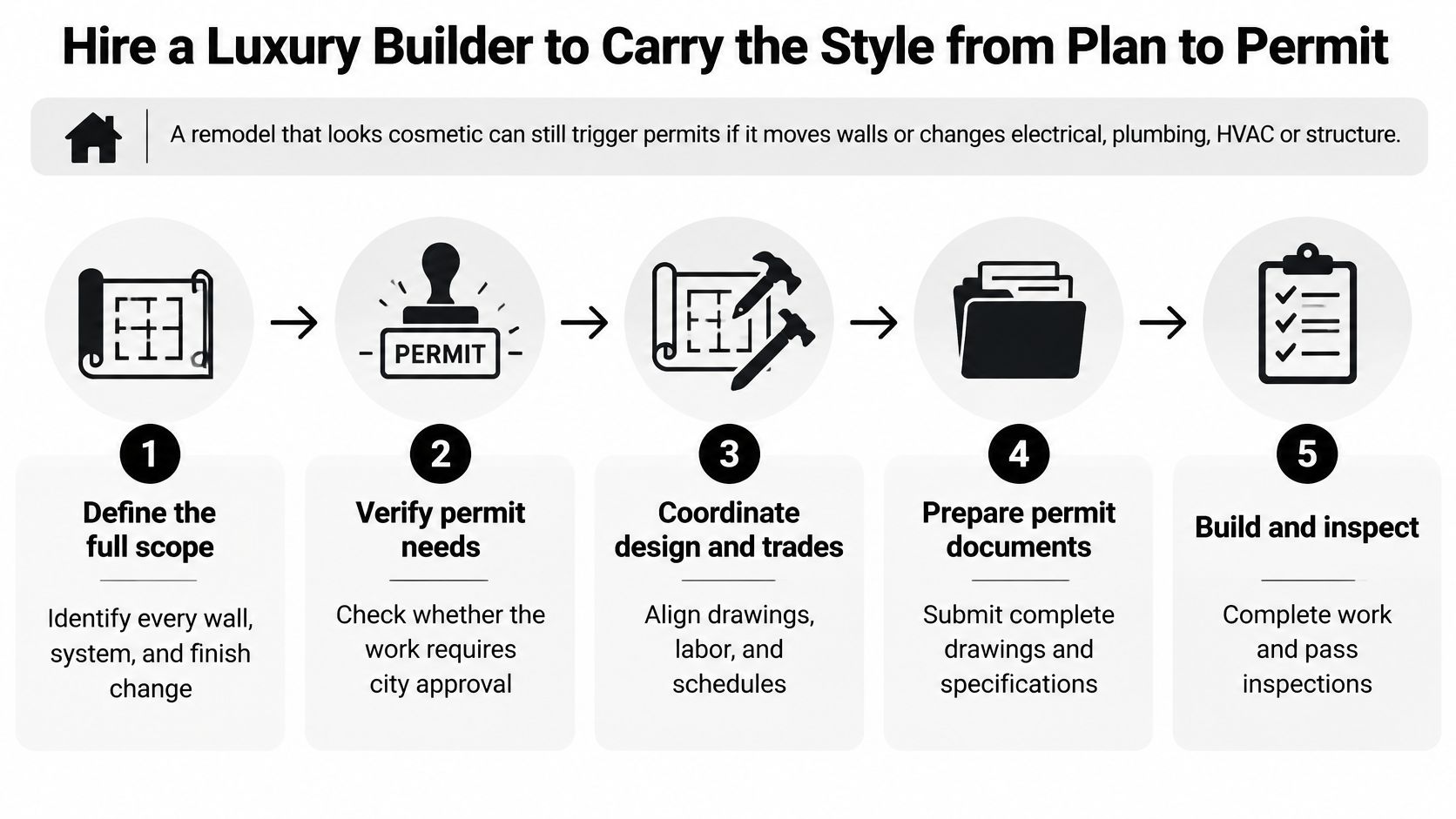
A finish plan can look straightforward while the work behind it changes walls, wiring, plumbing, HVAC, or structure. Those alterations may require permits. Scottsdale's permit-services guidance distinguishes cosmetic updates from work that triggers permits and directs applications through the city's SPUR portal.
For example, a cabinet refresh may also involve moving appliances, adding lighting circuits, or removing a partition. Set the full scope before calling the project finishes-only. That scope shapes both permit review and the construction documents trades will follow.
Use a Coordinated Construction Sequence
Define the full scope. Record layout changes, lighting, mechanical adjustments, cabinetry, glazing, flooring, and exterior work. Identify what stays and how retained finishes will be protected.
Check local approvals before finalizing design. Confirm municipal requirements and any applicable HOA review. Energy-code enforcement varies by jurisdiction in Arizona, so the builder should confirm locally adopted requirements. The U.S. Department of Energy's Arizona code profile outlines the state's code status.
Coordinate construction documents before submission. Resolve conflicts among architectural, structural, and trade drawings before submitting through the city portal. Scottsdale's home-improvement guidance describes review by Planning, Building, Engineering, Stormwater, and Fire. Permit issuance follows compliance and fee requirements.
Tie inspections to the work schedule. Set inspection hold points with the superintendent so crews do not cover work before approval. Put corrections in the schedule and communicate them to the affected trades.
Control finish approvals and orders. Review the finish-control board under the proposed lighting before placing orders. Document approved substitutions and resolve long-lead items early, when there is still time to preserve the design intent.
Close out the project in two tracks. Gather applicable final acceptance documents, equipment information, warranties, care instructions, and the outstanding-item list. Keep municipal acceptance separate from the contractor's review of finish quality; each covers a different part of closeout.
Hire for Execution, Not Just Presentation
Ask who maintains the lighting schedule, approves substitutions, and checks installed finishes against approved samples. For a whole-house remodel, clarify how the team records concealed conditions and gets approval for changes before proceeding.
Compare a proposed custom design-build process with those responsibilities. Renderings establish intent, but trade instructions, coordinated drawings, and finish approvals carry that intent into construction. In Phoenix, those decisions also affect how the palette and lighting perform under strong sun and dry conditions.
Emery Lane Homes is a custom luxury builder serving Scottsdale, Paradise Valley, Arcadia, and the Biltmore corridor, with design-build coordination, managed permitting, and dedicated QA/QC support. Choose a builder who can connect design decisions with local approvals and check the completed work against what was specified.
Emery Lane Homes offers custom luxury home construction and whole-house remodeling, coordinating layouts, finishes, lighting, and construction. Visit Emery Lane Homes to discuss a modern transitional home shaped around your family's routines and Phoenix's climate.